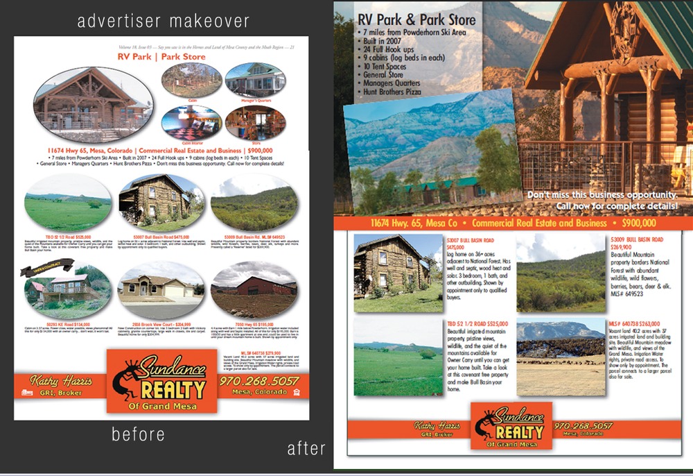
by Adrian AmosYou’re in the car with a homebuyer going to see numerous listings in a neighborhood. You’ve already been to a few homes and the next one on your planned route has overgrown bushes, the grass looks like an urban jungle, the home hasn’t been pressure washed in years, much less painted and the entry way looks dark and well acquainted with spiders.Your homebuyer most likely will want to keep driving (to your relief!). And can you blame them? You counsel your sellers religiously about the importance of curb appeal – literally giving a home stopping power – stopping by that is.Now look at your advertising from the same perspective. The homebuyer has already flipped through several pages of real estate and has several more to see. What in your ad has stopping power – inviting the buyer in to browse your listings and be tempted to see more?Large photos always help. So does adding something dramatic or different in your ad that sets you apart from the other pages. Consider it a freshly painted home with a well-kept landscape and some bright spring flowers welcoming buyers at the door.Notice the difference in the two ads below. The redesign not only gives the advertiser stopping power – she’s gotten more leads.
Ad design by Kim Collier.

